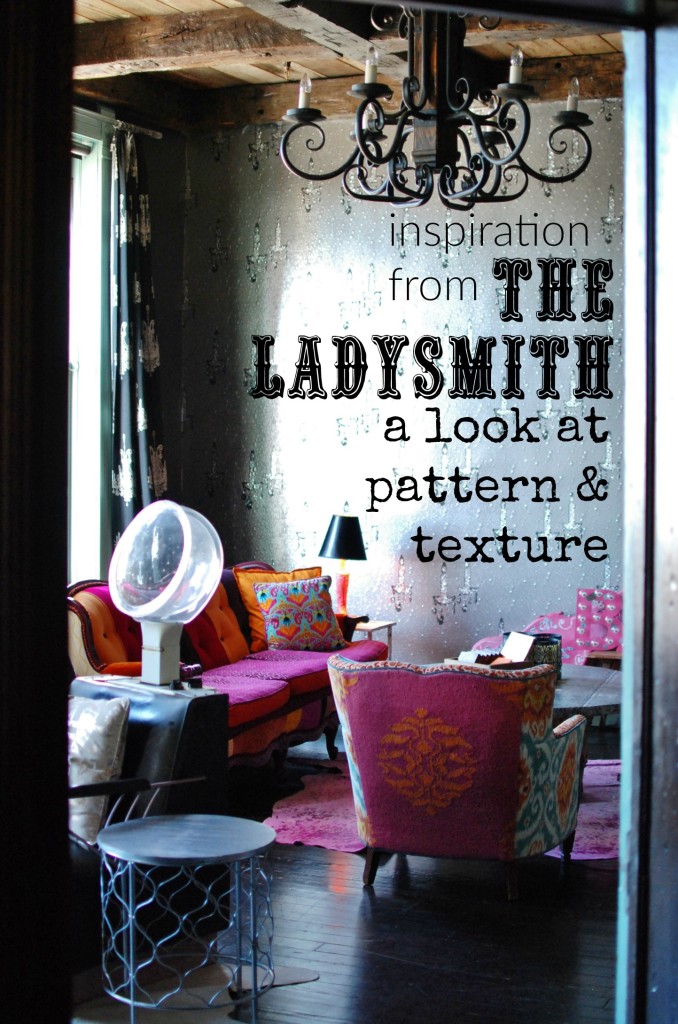
 Earlier this week I introduced you to Miranda Lambert’s Ladysmith hotel. Today I’m back with a deeper peek into the space and the design that makes it tick.
I suspect part of the reason I am draw to this place is the fact it’s a few steps removed from what you see in a regular home. It was never created to be a homey type space, but an adventure. It isn’t everyday you get to experience décor so fun and bold. While some parts are more than I could handle at home, there is so much I’d like to stuff in my suitcase to bring back. 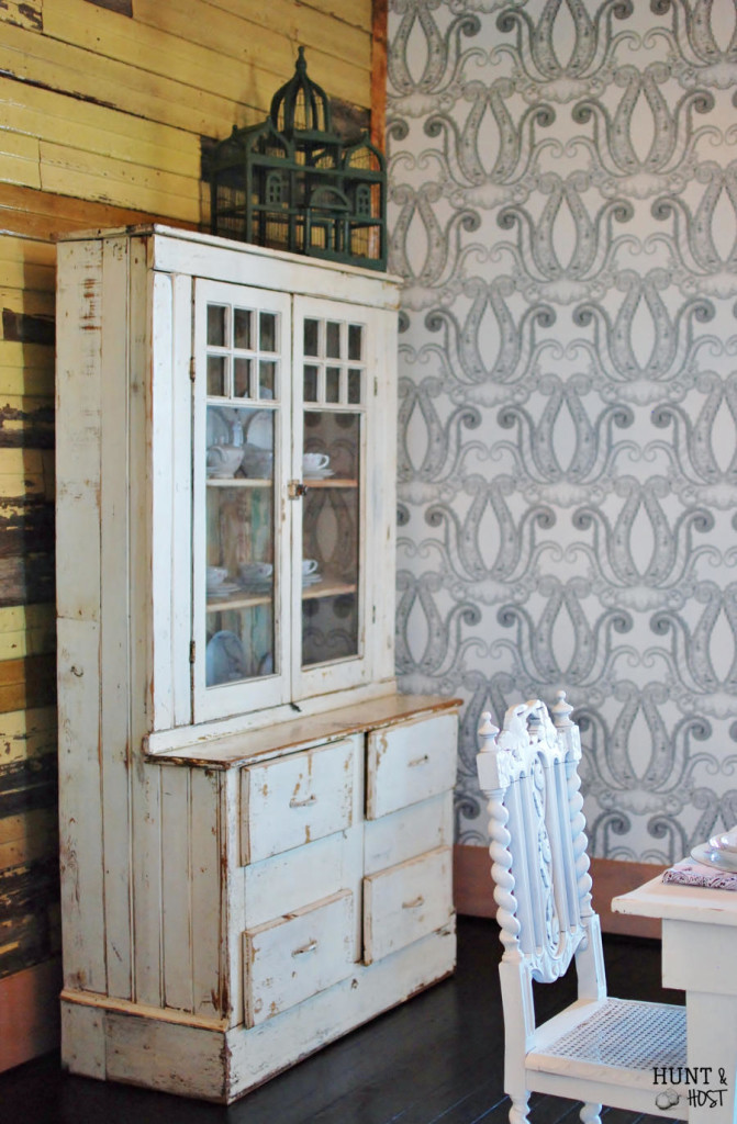
Even Phara Queen, Miranda’s interior designer, says she doesn’t get to do décor in the magnitude of The Ladysmith regularly because most people’s homes are not an “experience” in the same sense as this joint! So, the question arises…how can you infuse The Ladysmith feel into your home without being quite as crazy!?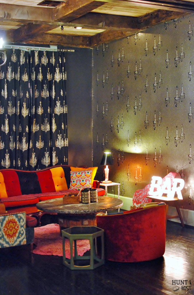
Phara says, “If you’re afraid to commit to something on a big scale, bring it down to a small scale. Mix your patterns and textures in pillows. Keep the background neutral and bring in something BIG, like a funky pillow in a fabric you’ve always wanted to use but never thought you could. “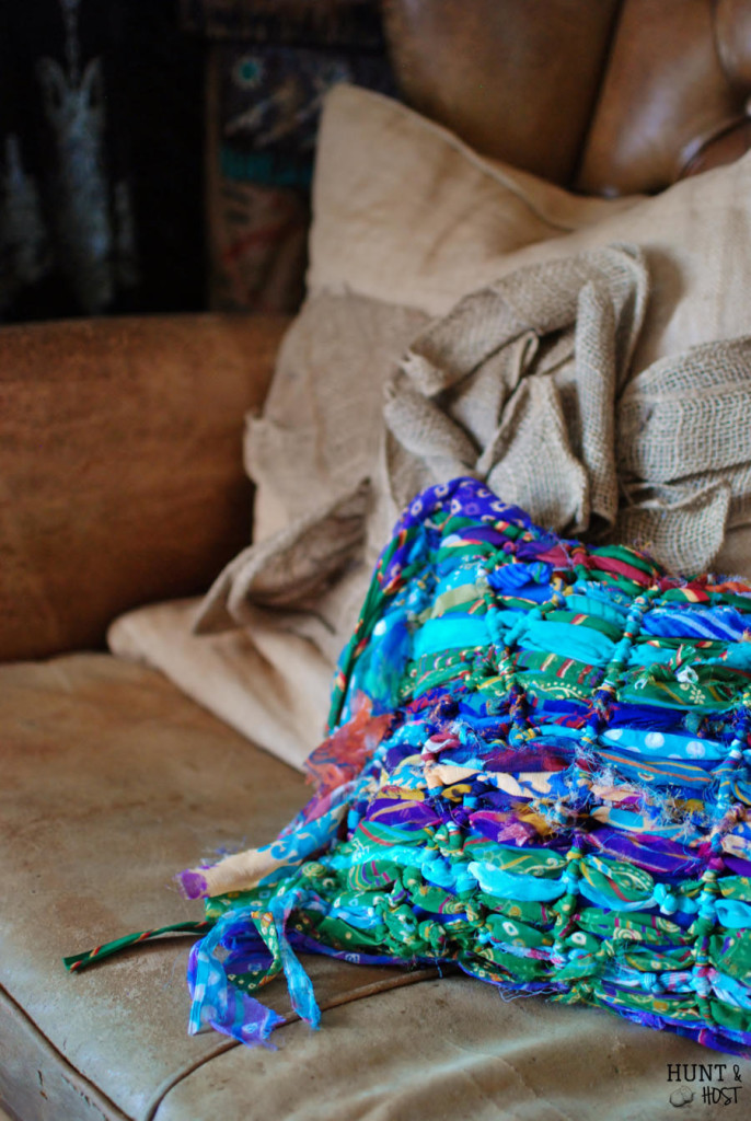
Pillows are a great way to spice up any room in your house. Check out my pocket pillow tutorial so you can have a revolving door of pillows in your décor stash.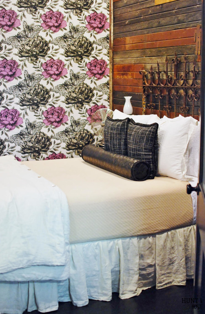
Another suggestion from Phara is to contrast the texture on your walls and furniture using wallpaper. The wallpaper selections in The Ladysmith are TO DIE FOR! Pictures don’t so them justice. They all have a special characteristic to them. Some are metallic with a gorgeous reflective quality, some have a velvet texture running through. The room I stayed in had a a kaleidoscopic feel that can’t be captured on film, at least not by my ametuer photo skills! Look at this…ya’ll know houndstooth is my favorite color!
Again, Phara suggests going small, “Use a bold wallpaper, but only on one wall or better yet on the ceiling. Or try wallpapering a closet with an out of this world wallpaper that you love but you’d be afraid to put on four walls much less one.”
Pattern and texture are what take a room from flat and boring to interesting and alive. Look around whatever room you are wanting to liven up and take inventory. Do you have a good mix of textures? A variation of wood, glass, metal, fabric, painted furniture and raw furniture. Too much of one thing can make a room feel blah. 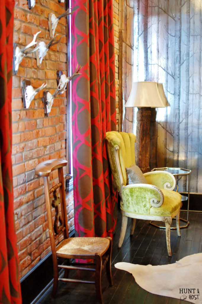
Look at your patterns. Do you have a mix of woven, small print, large scale print, smooth finished, rough finishes and dimension. You see beautiful monochromatic rooms everywhere, but people often have a hard time pulling off that style. We rely on color to liven up a room, but pattern and texture are better candidates for the job. 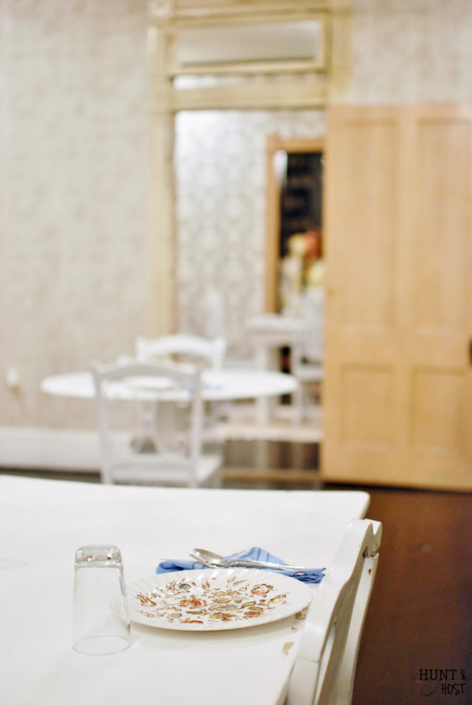
These are just a few great tips to help you get started on building a room of your dreams. Start small with a neutral background and layer in bold pops of pattern and texture, then work your way up from there! Thanks Phara for some inspiring ideas! next week we will take a look at styling a bed! 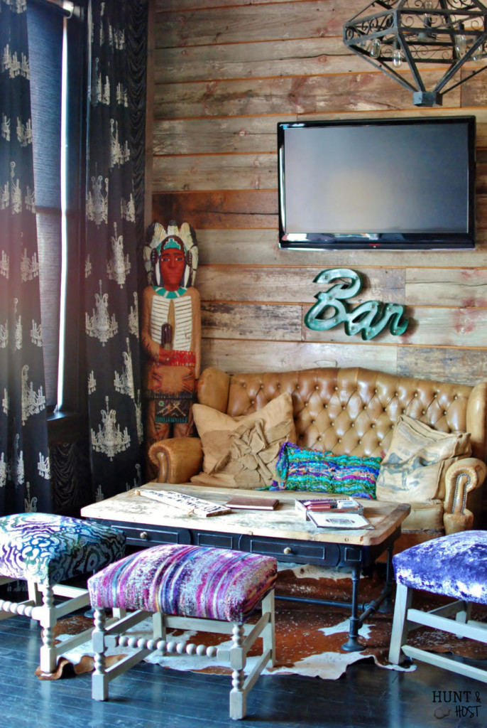
Check it out:


Leave a Reply