By failing to prepare, you are preparing to fail is a famous quote by Benjamin Franklin. Creating a vintage mood board is the perfect preparation to design and implement home decor you love and adore. You could call it the ultimate plan for success, old Ben would be happy with us. I’m so excited that Carpet One Floor & Home invited me to check out some gorgeous samples in celebration of their 2023 Floorcast. Basically, I got to plan for success with some of the latest designs in flooring and build a mood board from the floor up so to speak! I wanted to share my belief in how important a mood board is and the inspiration behind the two boards I created. Hopefully, this inside look at the thought process behind my vintage-inspired mood board will encourage you to create your own! I also have one SUPER interesting point to make about mood boards, I’ll show you at the end so read to the bottom to see!!!!
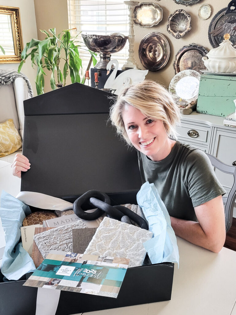
There is never a bad time to revamp a room and even if you can’t put all the parts and pieces together right now, a road map of the end result will keep you headed in the right direction. Flooring is a huge piece of the puzzle and to help homeowners, Carpet One Floor & Home, a North American cooperative of 1,000 locally owned flooring retailers, analyzed buying patterns, conferred with interior designers, and considered lifestyle predictions to come up with its “2023 Floorcast” of the hottest flooring trends for 2023! To say the least, they curated all the best trends and shared them with us, doing the heavy lifting of sifting through endless choices.
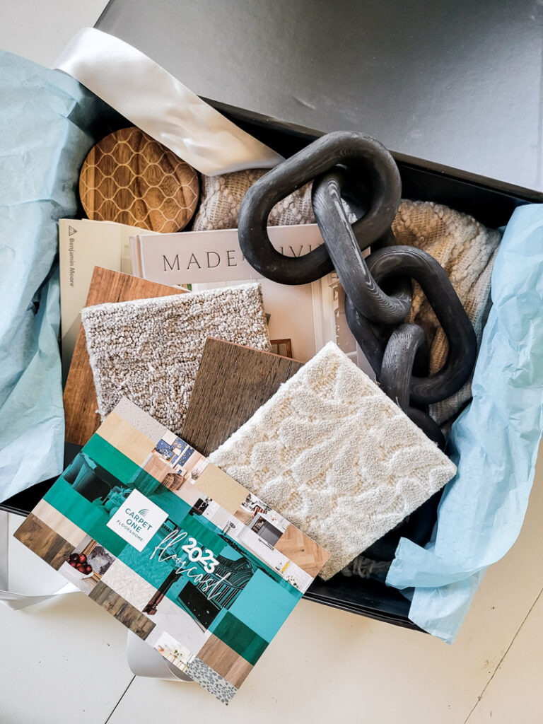
I adore vintage items but a room full of ALL old stuff can get kind of stale. You need to find a happy mix of old and new. Flooring is the perfect spot to add in a fresh, current touch. Carpet One found this year’s trends feature replacing straight lines for curves, making a splash with big, bold colors, embracing biophilic designs using eco-friendly materials, and even combining retro with futuristic designs. I couldn’t agree more and found their gorgeous colors and patterns easy to mix into my vintage style.
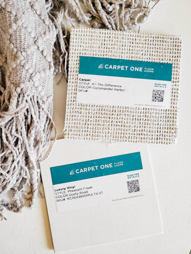
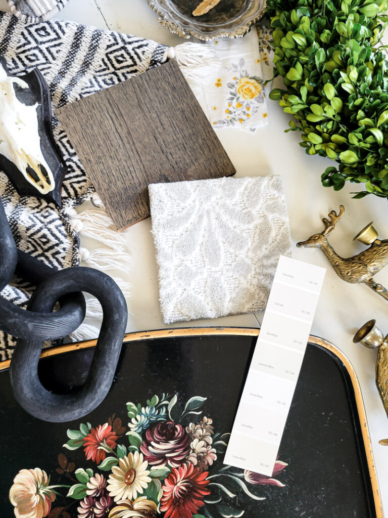
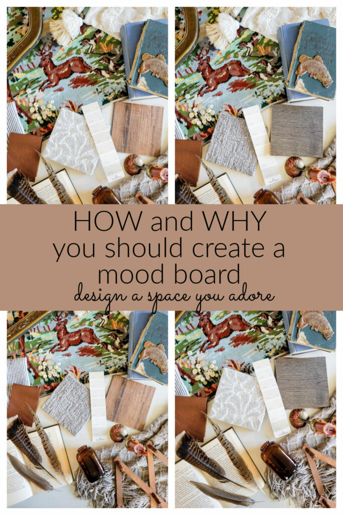
I started the first design board with a rich, plush carpet in a style called All The Difference (color: Coromandel Harbor) paired with a luxury vinyl called Pheasant Creek in the color Dusty Road. I am in love with the texture and pattern of the carpet and the rich cozy tones of the vinyl wood. The best part is how well the “new” compliments the “old”. Honestly, these days we have so many options in flooring, why wouldn’t you add interest there instead of just focusing on the “walls”!!!
For this vintage mood board I wanted a lived in take on the traditional black and white color palette. Bold and masculine with touches of soft, feminine florals and nature elements. I always try to pull in different textures and subtle colors that blend. Creating a cohesive color palette is essential. You don’t want to be matchy matchy, but complimentary.
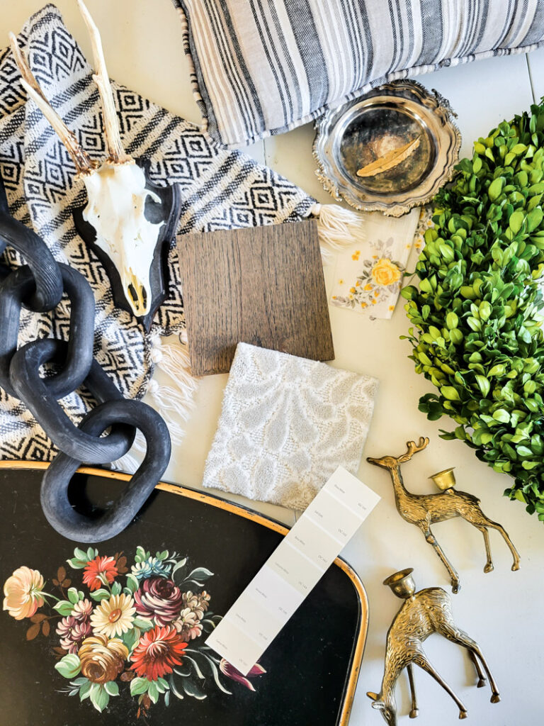
Pick out your inspirational decor pieces and match them with your flooring choices, move through to your wall colors and fabrics. Make a mental list of the design elements your room will need and find something that speaks to the material you will need for each element – fabric, carpet, tile, bedding, paint, wall paper, metals, wicker, glass, nature, paper. Layout a healthy mix of textures. A good mood board consists of trying things, laying them together, seeing how they play off each other and then editing out what doesn’t fit. Go ahead and add in crazy elements, you never know what just might work!
This room showcases our love of vintage decor by mixing vintage finds with our current favorites. Wildlife and animals are a staple in our home, so vintage taxidermy checked that box. To soften the feel and cozy up our space I wanted to add in florals. That sweet spot of balance.
I love the idea of mixed metals, silver, brass and gold, no need to commit to just one! Even the pillow fabric I pulled in has threads of metallic running through. This mix feels timeless to me and that checks another box/goal I was striving for.
Bold patterns like the scalloped pattern carpet and geometric throw blanket get paired with and toned down by soft florals and textured solids. Of course bold black accents anchor almost any space!
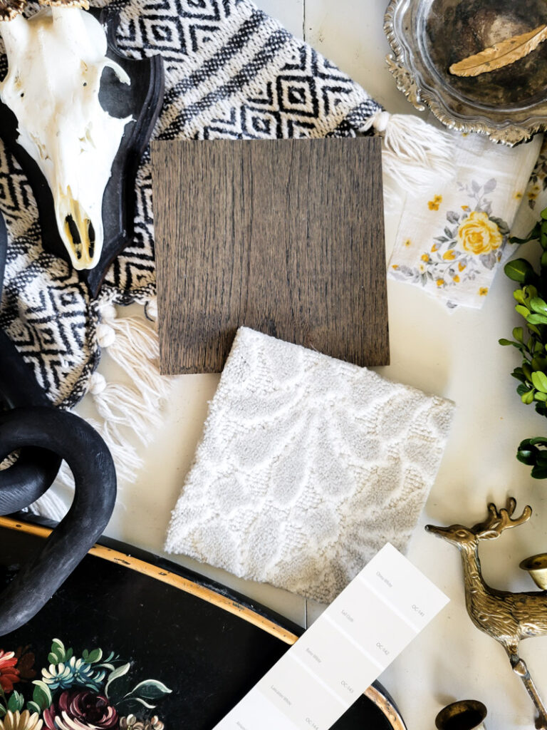
Greenery is a beautiful color and texture element that warms up a more monotone color scheme without stealing from it.
The overall vibe I was hoping for with this vintage mood board was a more modern twist with a neutral palette. As I added things and edited them out, I was left with a small square of things that felt exactly like the vision in my head.
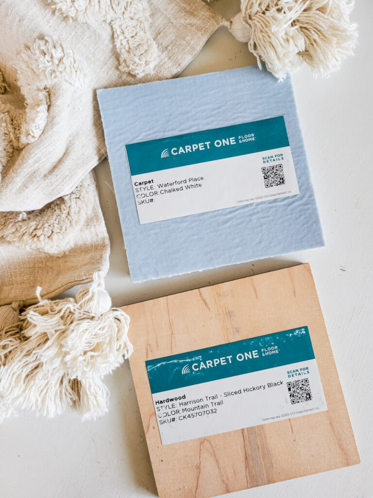
The next mood board I created changed the game a bit with a warmer feel and more of a vintage lodge kind of vibe. The design kicked off with Carpet One’s Carpet, Waterford Place in the color Chalked White mixed with the stunning hardwood flooring, Harrison Trail – Sliced Hickory Black in the color of Mountain Shade. I literally can’t stop dreaming of this hardwood floor y’all!
The entire mood board is built around a nature inspired feel of soft taupes, grays and browns. I wanted a well worn, curated over years, cozy vibe. I have a vintage cross stitch I bought in France and it is my anchor wall piece. By using it as my core inspiration piece I was able to pull out the colors and textures to decorate the rest of the room with. The second layer of inspiration was the color of aged book pages. That creamy, warm tone is so yummy! ANYTHING can be your inspiration and starting point!
Warm leather touches, magnificent deep colors in bird feathers, old books, brown bottles, rusty ephemeria and all the textures and layers I want to bring into the room.
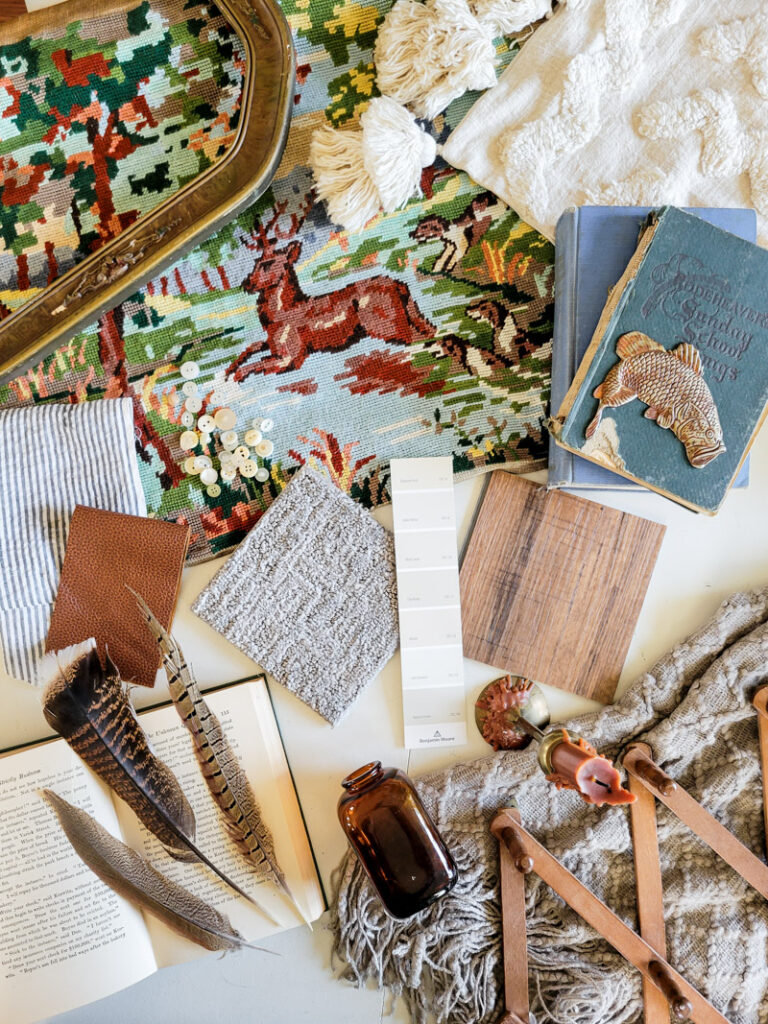
The anchor design elements for this space lie in the small stripe fabric that adds a modern touch along with the nubby, cozy feel of a taupe throw blanket and old paper colored accent pillow full of boho textures. Every great room has a cast of characters, a leading lady in the spotlight and a delightful cast of supporting characters. Don’t try to have too many lead roles, the storyline just gets messy!
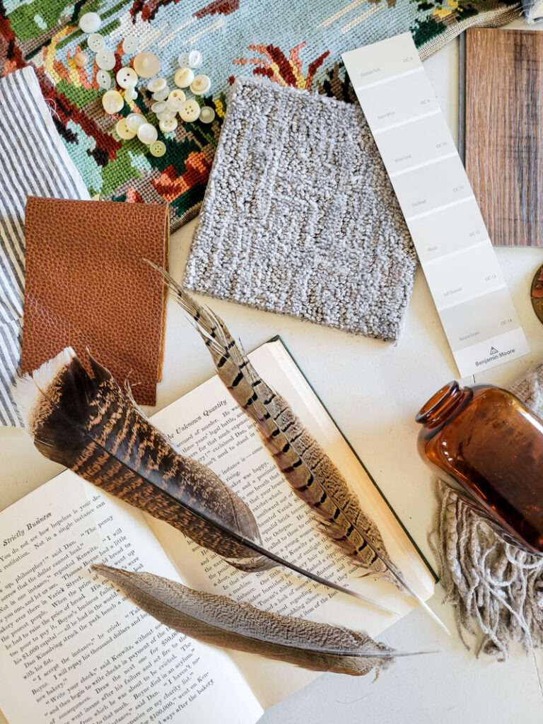
Paint is an essential element to any room and getting your shades and temperature correct make all the difference. When you create a mood board, you are able to thumb through a stack of paint chips and see the colors blend or disagree. It makes it soooo much easier to select the best paint colors for your overall goal! Honestly, a mood board is one of the very best ways I’ve found to pick your paint colors. Just wait until you try it, I promise you’ll see how shades of paint show their true colors, purple undertones, heavy yellow or too much green – they all come out of hiding when placed in the center of your design elements!
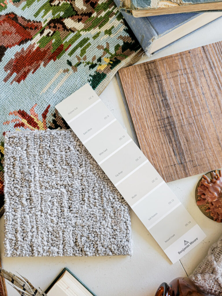
Like I mentioned earlier, even if you can’t pull off all the updates for your decor creation right now, keep this mood board as your guide. Take photos of it, get close ups of the elements. When you are out shopping or come across an item on sale, you will instantly have this mood board to guide your purchases with a quick glance. You’ll pass on things that don’t work and have confidence making purchases that you know will go in your newly renovated space. It’s a game changer for sure!
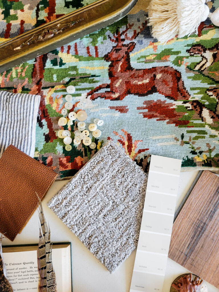
Now for my favorite part and point to make about designing a mood board and creating a space for yourself. Look closely at the collage below, there is a very subtle difference in each picture. Can you see it? This blows my mind – when you create for yourself and no one else, just about any element you add to a room can move around in your home and get interchanged among your things. You have a core color palette and design aesthetic, you may not even realize that, but you do! I can mix and match the flooring options I love in these spaces because, at the core – I pick what I love and it all blends. Stay true to you and all the things will fall into place!
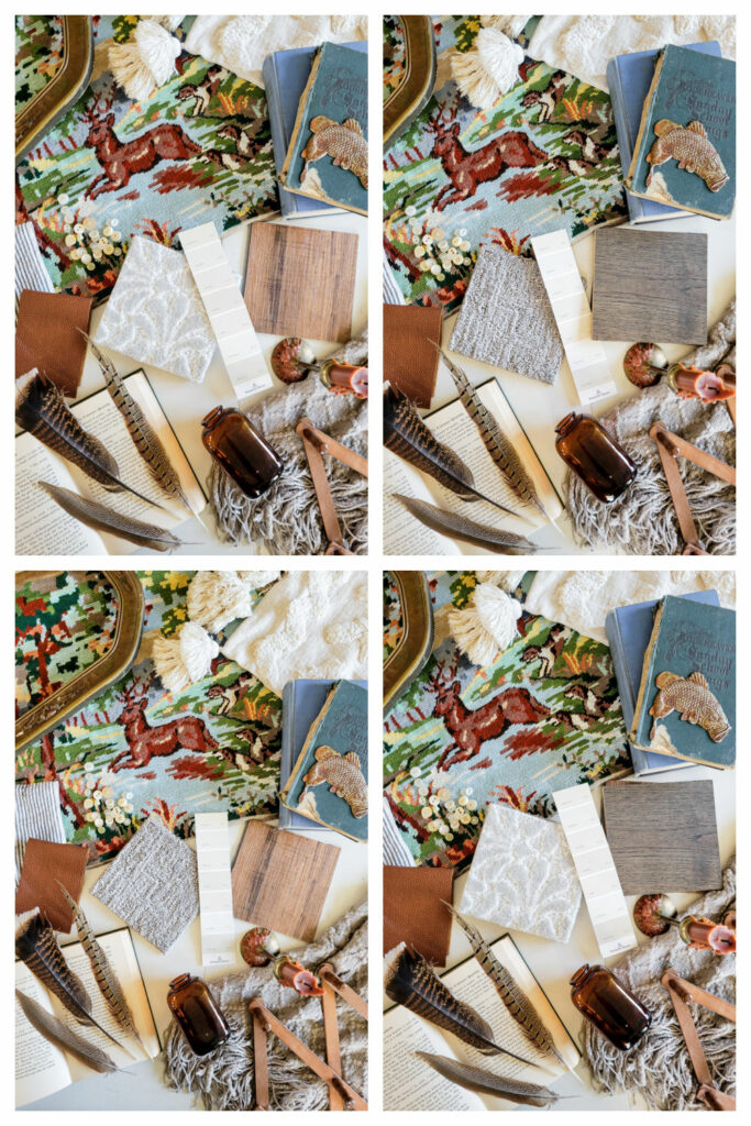
I can’t wait for you to try your hand at creating a mood board, perfect for YOU! If you want to start from the ground up like I did, don’t forget to visit Carpet One Floor & Home to check out the 2023 Floorcast. I’m so glad I did! Now tell me, which mood board is your favorite and why?
Save these tips for later:

Leave a Reply